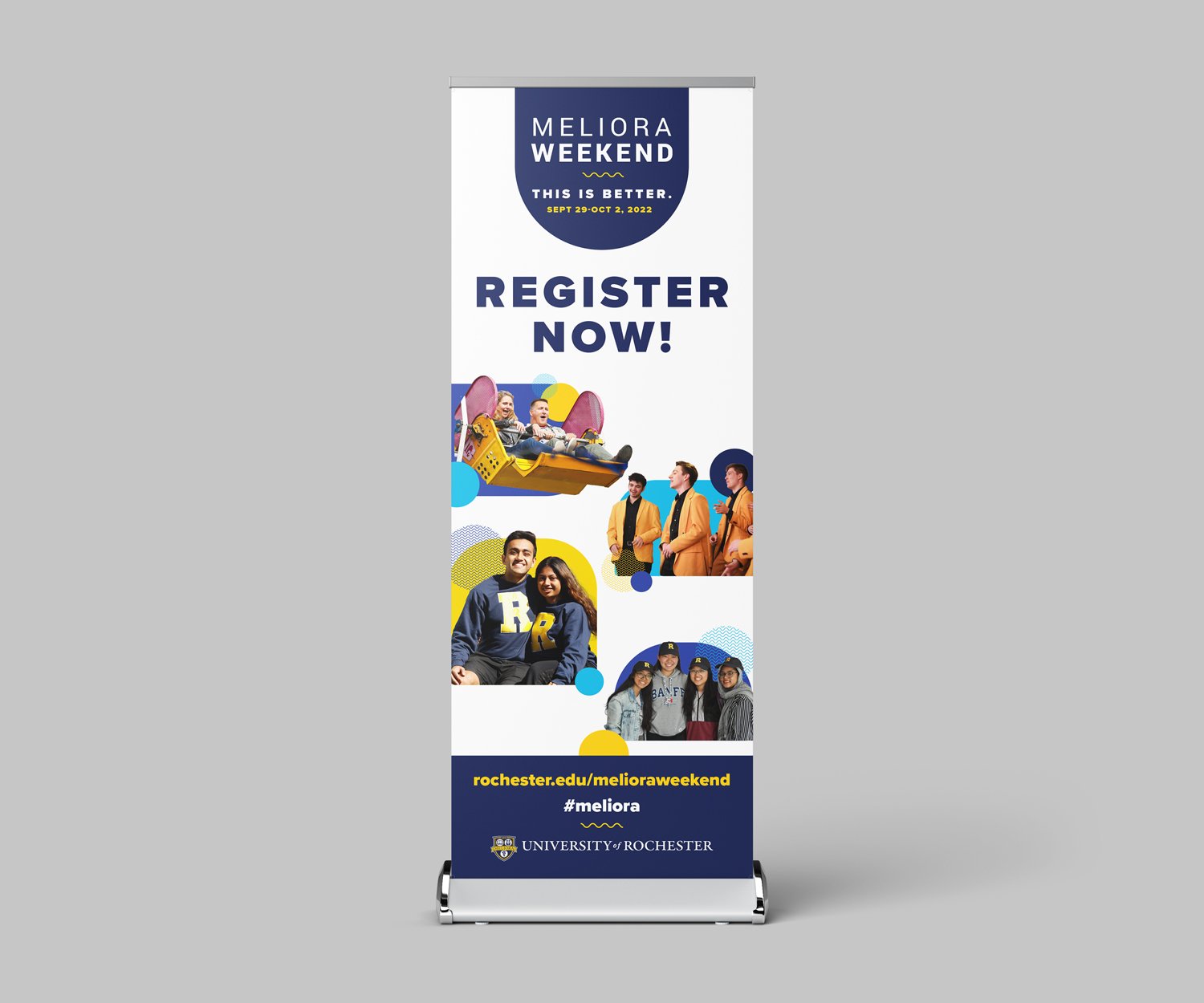
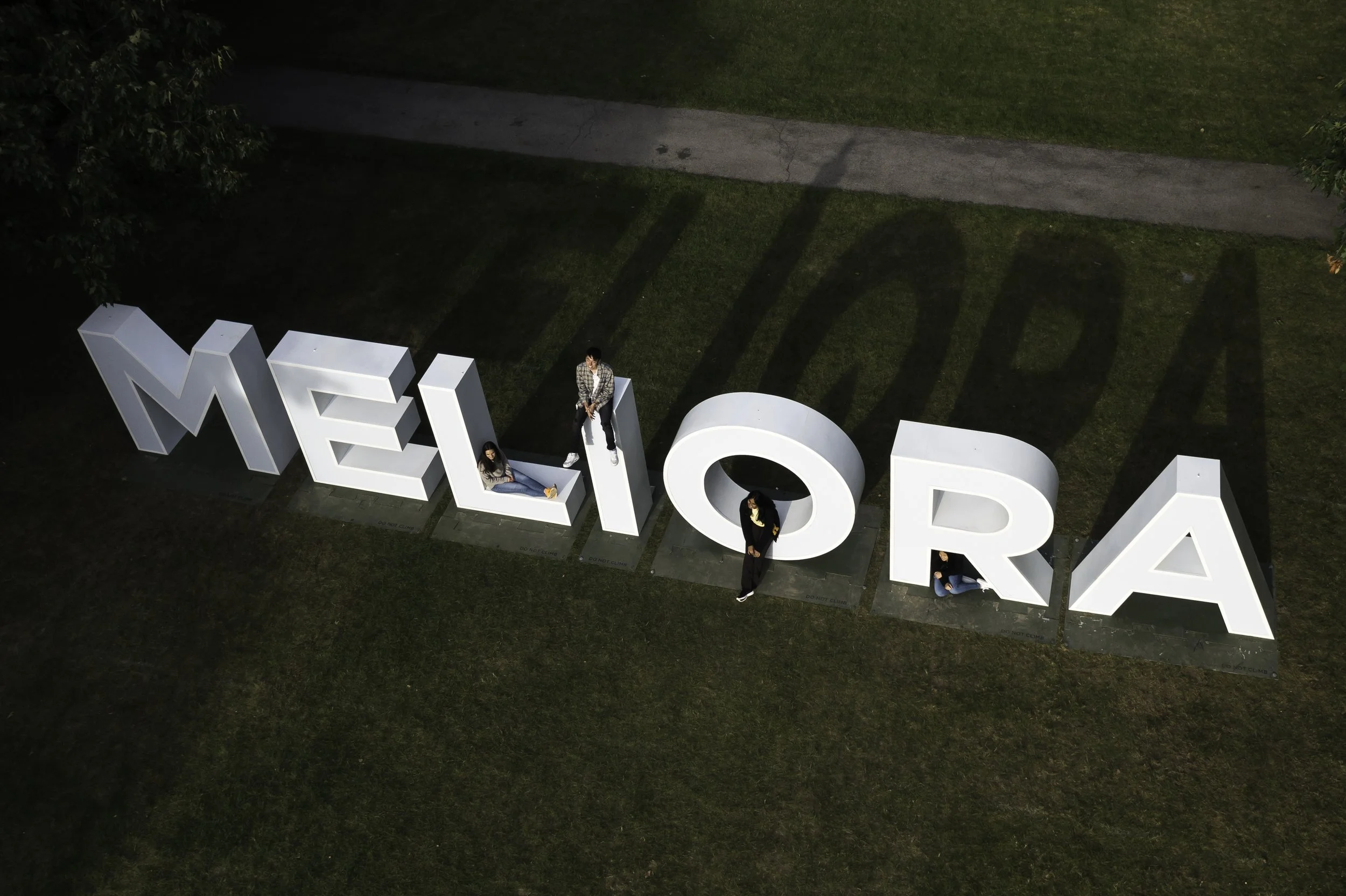
At University of Rochester, Meliora is more than a mission, it’s a way of life. For our alumni, Meliora Weekend is where classmates return to campus for inspirational speakers, fun class reunion programming, and to reconnect with campus and the Yellowjacket community.
In 2022, after a canceled COVID Meliora Weekend, and truncated virtual 2021 event, our team was in the clear to plan a “business as usual” reunion weekend. Our tagline for the event was “This is Better”, as a nod to the state of the world, and a play on our mission Meliora (meaning ever better). Our goal for the event was to engage our alumni who may have been nervous after a few years of social distancing and bring folks back to campus.
Through light and airy photography, playful layouts and textures, and a scrapbook-like look and feel, our strategy was to connect our alumni with the nostalgic feeling of being together with friends on campus. The friendly creative approach was in stark contrast to what many folks had been seeing in the media after 2 years of COVID precautions.
Deliverables included posters, banners on campus, digital assets, social media, traditional print ads, event collateral, nametags, swag, app assets, mailings, and environmental design.
Team:
Michelle Hildreth, creative direction
Nancy Zawacki, media relations
Rita Mannelli, alumni marketing
Megan Petty, alumni marketing
Sydney Burrows, social media
J. Adam Fenster, thumbnail photo
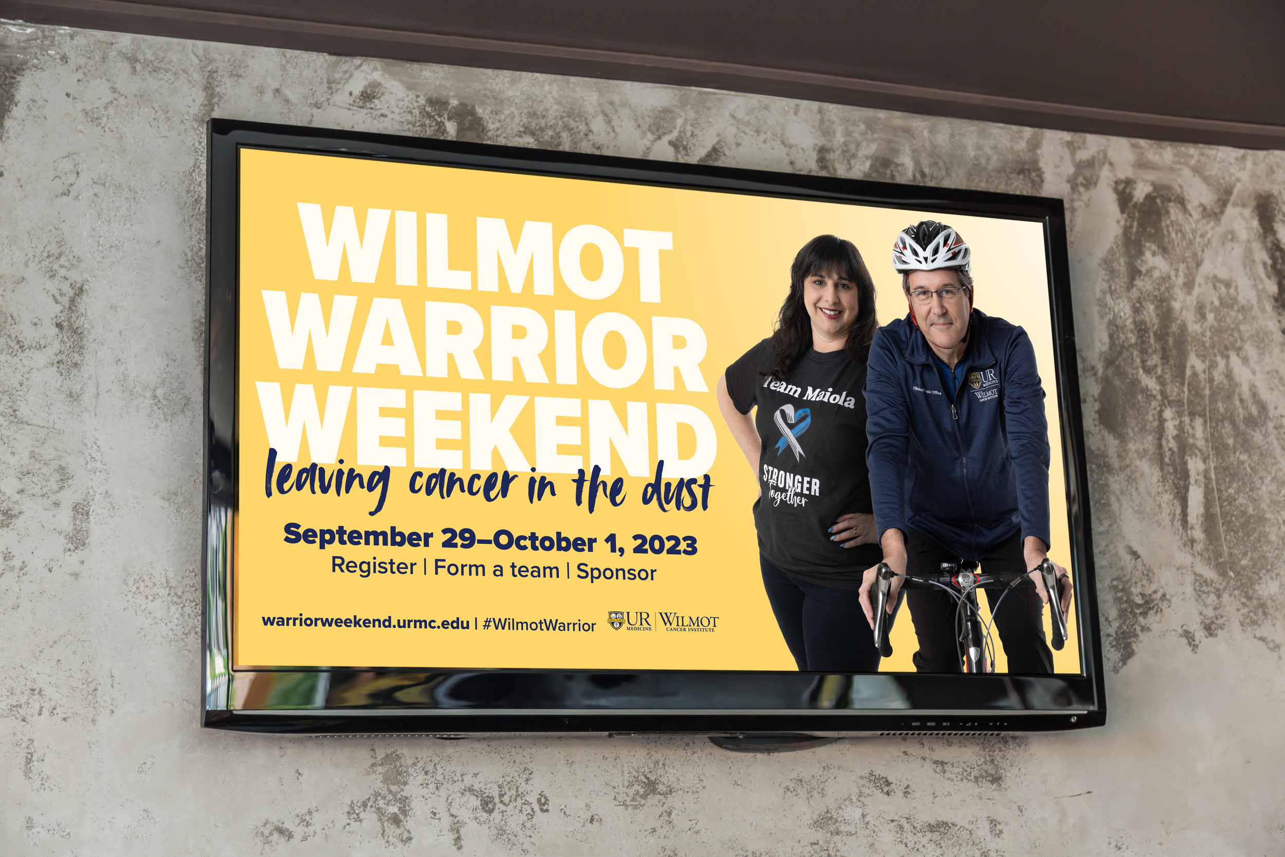
The Wilmot Warrior Walk has been a hallmark event in the Rochester community for the last decade to celebrate cancer survivors, honor those lost in the fight, and inspire hope to the community touched by cancer. The event is also a fundraiser for the Wilmot Cancer Center, allowing the organization to continue to fund cancer research and treatment in the Rochester community and beyond.
In 2023, the Wilmot team set out to expand the event further than the walk to include a cycling event to round out the weekend and also to engage more athletes to surpass fundraising goals.
Alongside my creative director Michelle Hildreth and strategist and marketing director Nancy Zawacki, we built this campaign from the ground up from creative strategy, photography direction, video scripts, layout, media recommendations, event design, digital assets and a multichannel marketing campaign.
The goal for creative direction was to instill hope using the University’s dandelion yellow, and infusing anecdotes from our ambassadors who had been involved in research, treatment, philanthropy, and as friends of Wilmot to anchor our messaging within the community.
Team:
Michelle Hildreth, creative direction
Nancy Zawacki, marketing and strategy
Tyler Bowers, Wilmot marketing
Kristina Beaudett, copy
John Myers, photography + videography
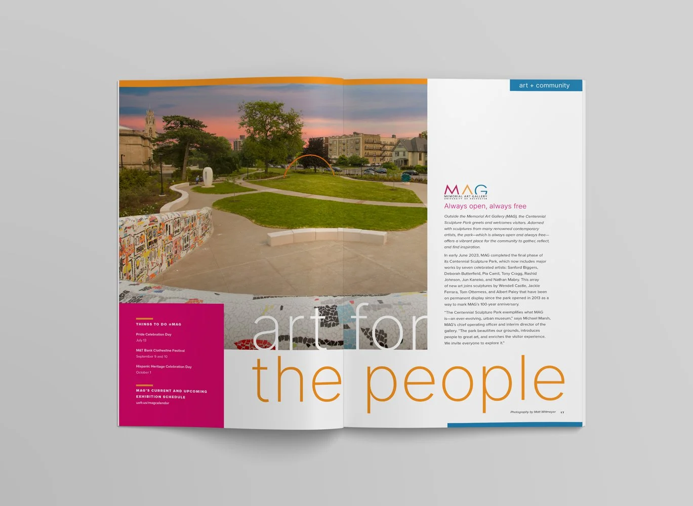
Matt Wittmeyer, event + thumbnail photography
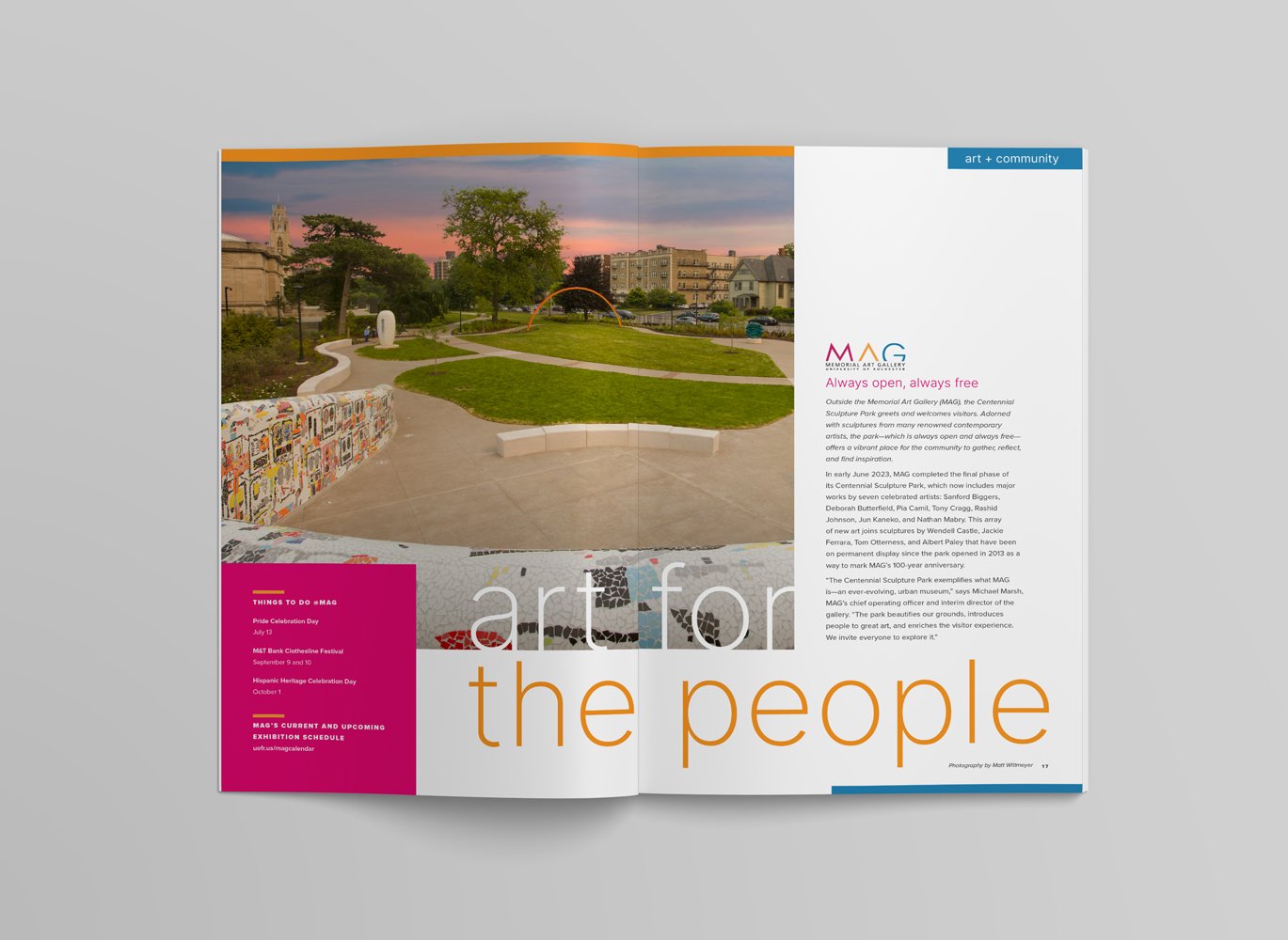
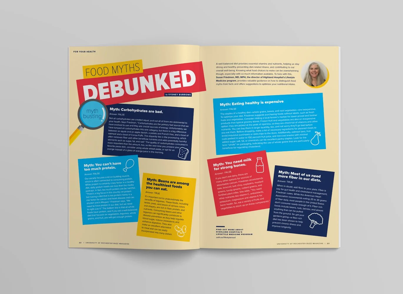
Buzz Magazine was a publication designed for our alumni and friends of the University during the pandemic. Regular features included alumni spotlight stories; contributions from our staff like nutritionists, physical therapists, and artists; and other inspirational stories from our UR community. This publication became a cross-departmental venture, from highlighting MAG exhibitions, to Eastman students, to campus deans, to folks from our medical center. Though its first issue was created during the pandemic, Buzz ended up spanning multiple issues, highlighting dozens of stories and alumni throughout its run.
Team:
Michelle Hildreth, creative direction
Erin Kane, editor
Kristine Thompson, copy
Sydney Burrows, copy
Nancy Zawacki, marketing
David Hildreth, illustration
Matt Wittmeyer, photography
Various logos done for both internal and external clients:
University of Rochester:
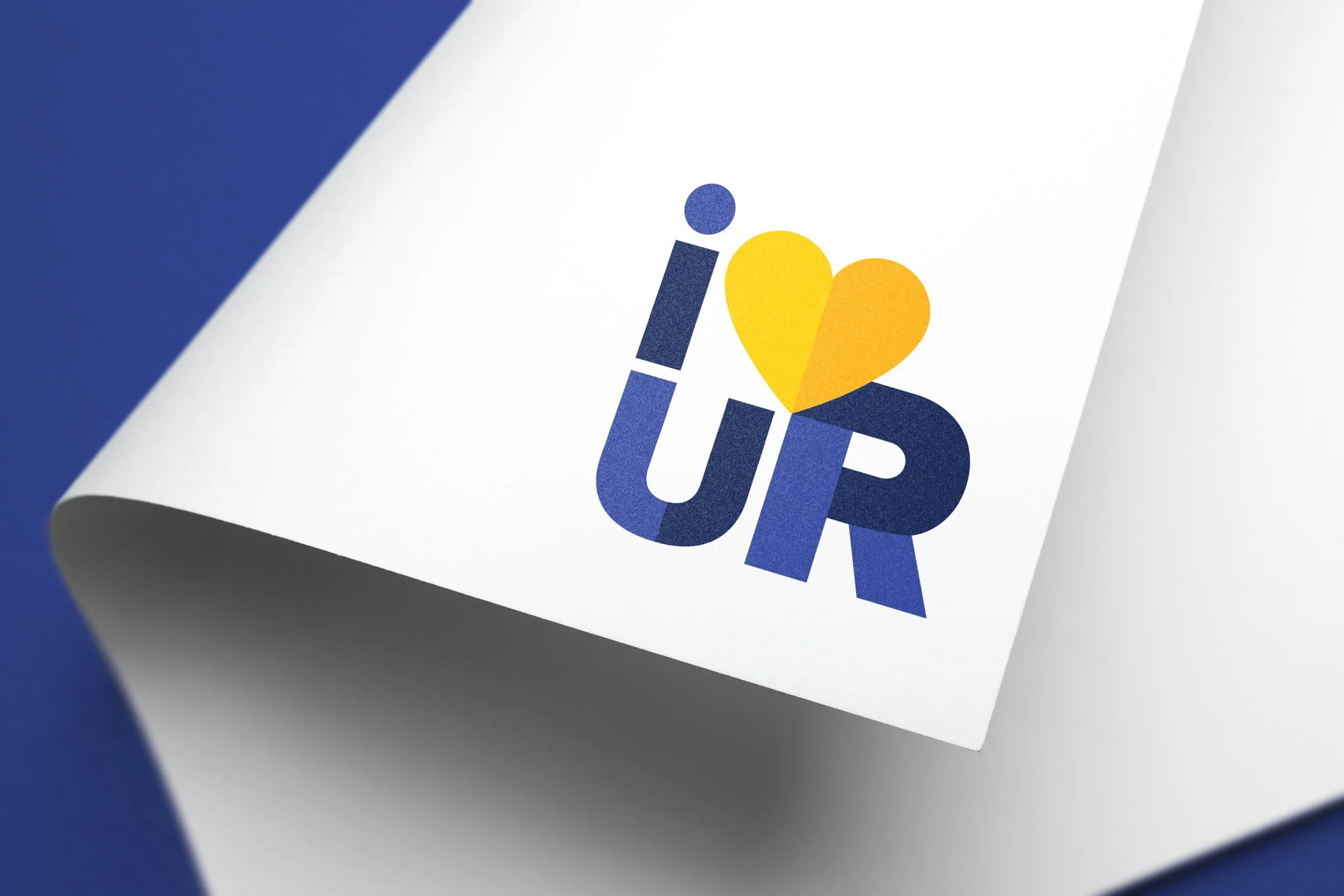
- I Heart UR
- LGBTQ+ Network
- Studio X
- Celebration of Diversity
- Professional Power Up
Nichols School
- All iN Campaign
Rochester Running Company
- Runnin’ of the Green 5 Mile
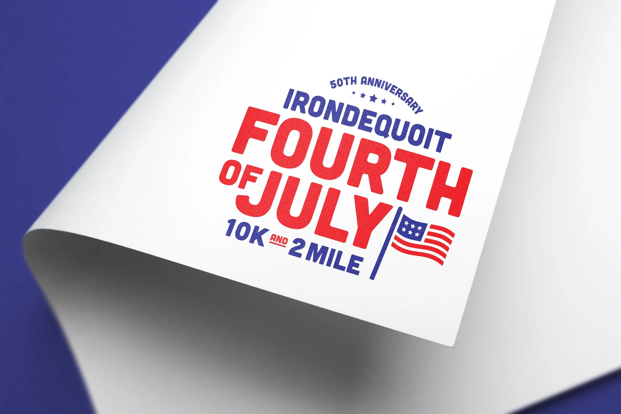
- Irondequoit Fourth of July 10K
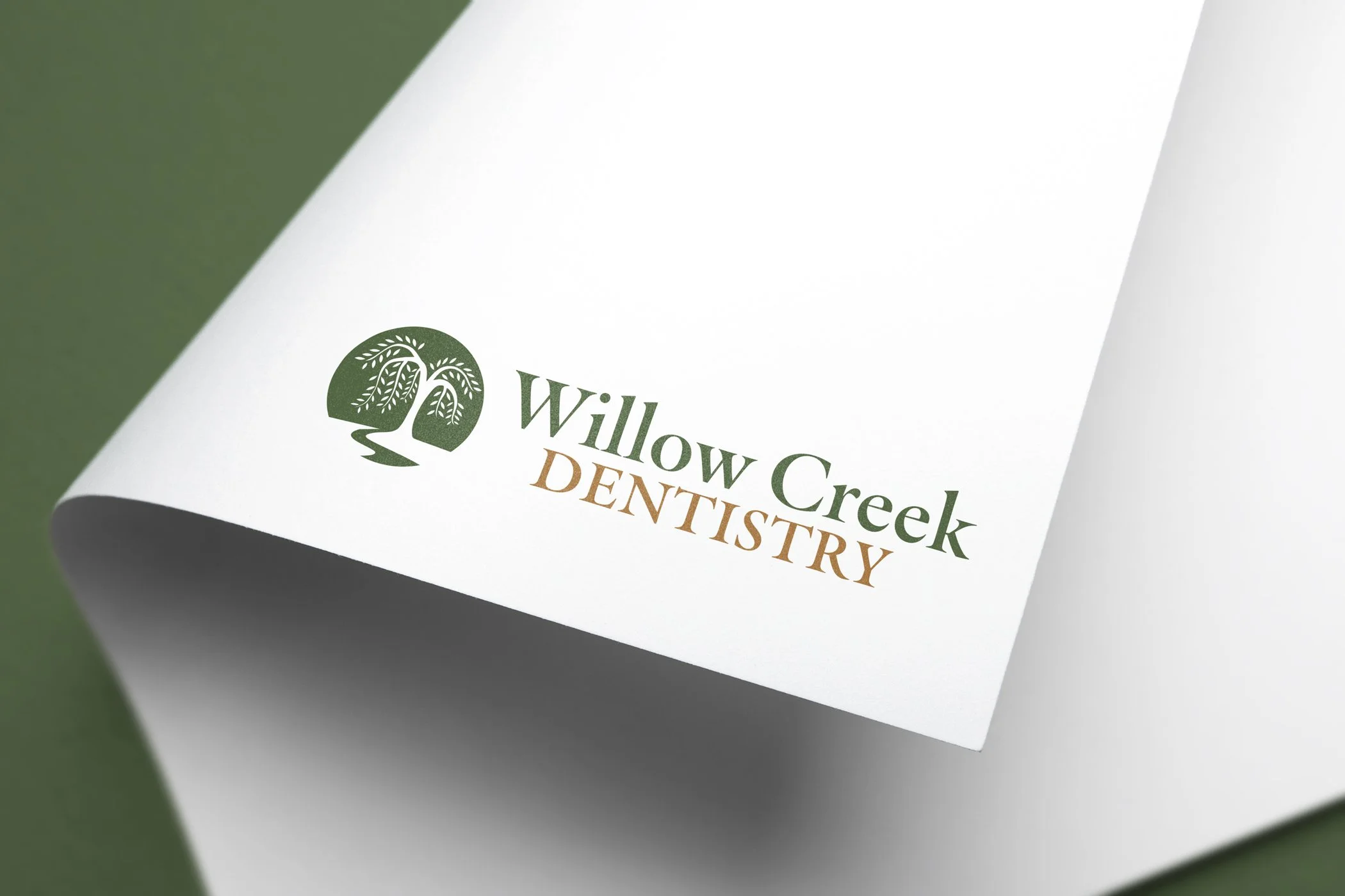
Willow Creek Dentistry
- Rebrand
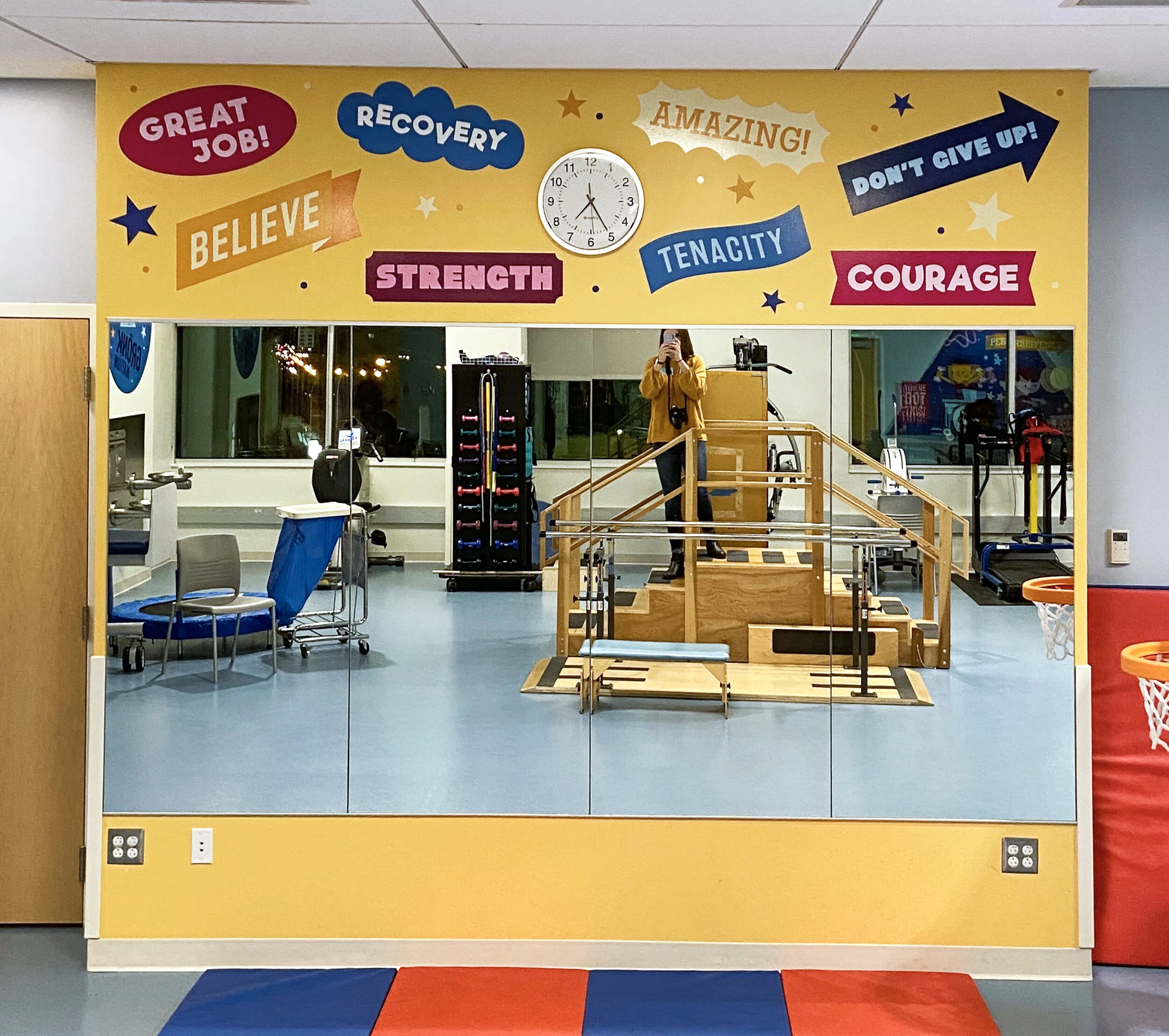
At The Martin Group, I worked with the team at John R. Oishei Children’s Hospital in Buffalo, NY to design the spaces of the hospital and clinic spaces with fun illustrations to distract from what could otherwise be scary situations for children undergoing treatment.
The creative strategy for this particular space was to be inspirational and engaging, while showing children of all abilities undergoing physical and occupational therapy. We wanted every child who went through the clinic to see themselves on the walls while going through their rehabilitation journeys.
For this project, I worked with the illustrators Pretend Friends to bring this vision to life, art directed and concepted each separate space, oversaw the installation by our partners from VSP Graphics, and meched and released all files.
team:
Andrea Elliott, creative direction
VSP Graphics, installation
Pretend Friends, illustration
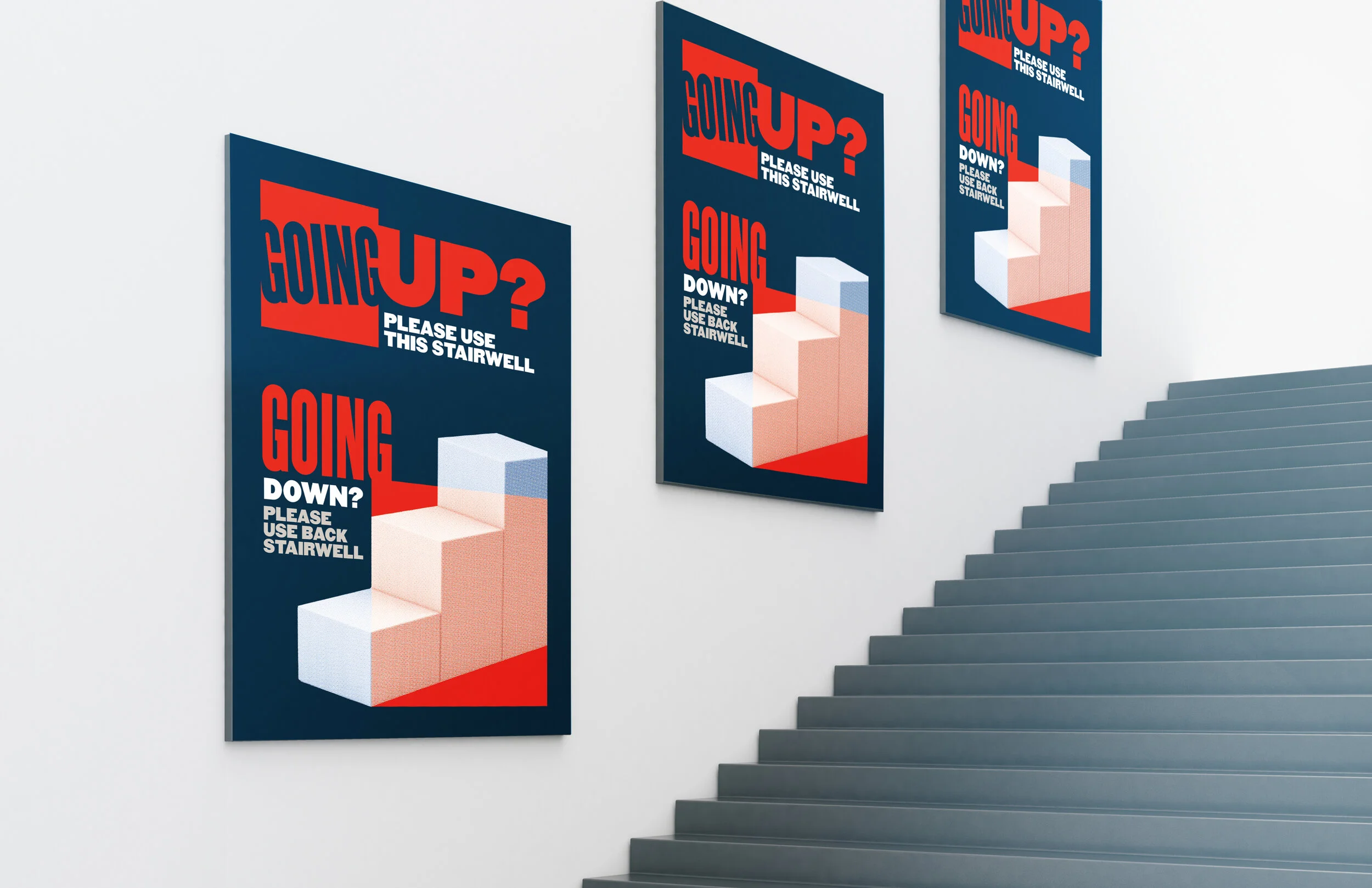
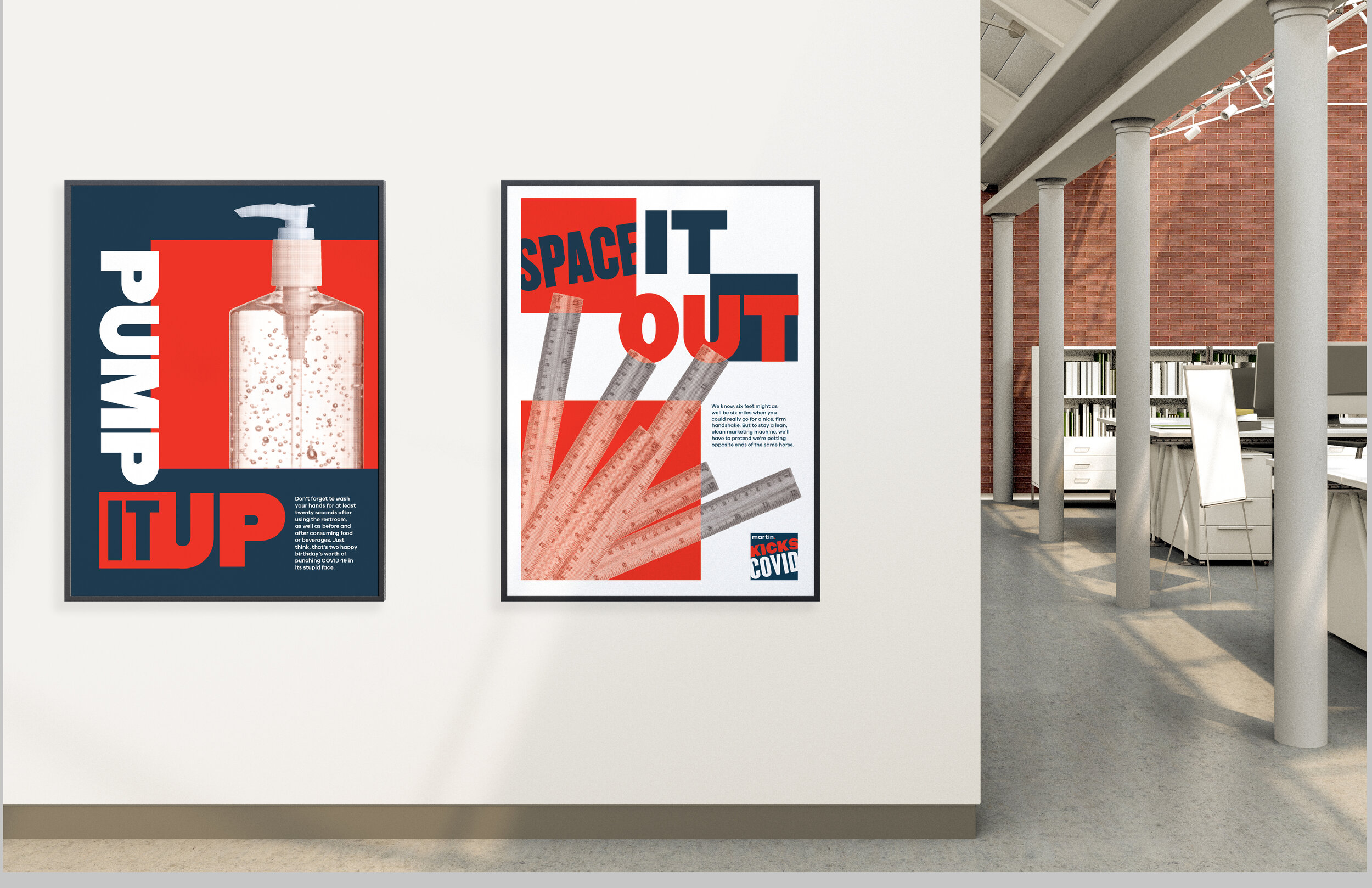
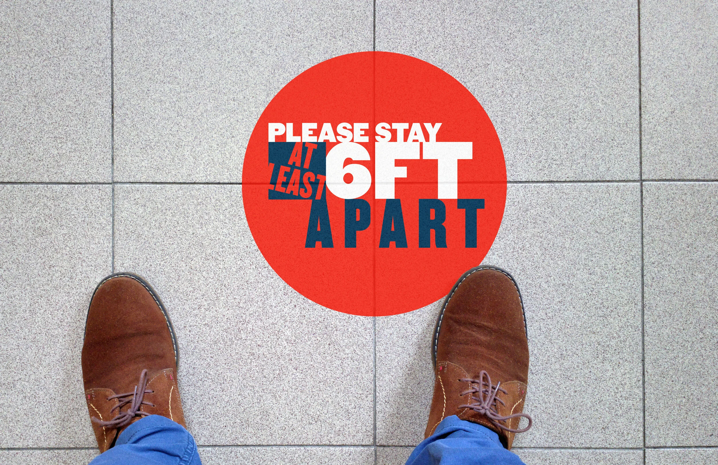
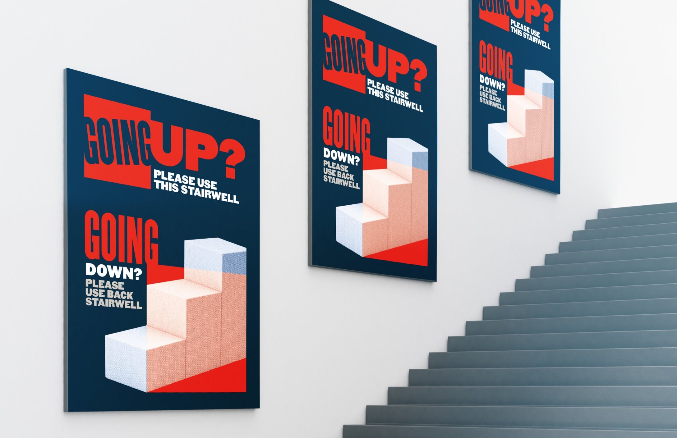
Like most workplaces in 2020, my former employers’' office was totally flipped upside down when it came to COVID-19. The pandemic lead to an influx of home offices, forgetting what it feels like to wear pants with a waistband, and learning to mute ourselves on Zoom. Eventually, however, our team decided that associates could come in and work in the office, so long as proper protocols were followed.
For those opting in to working in the office, we created clear boundaries with our shared spaces. Messaging included fun and short headlines to compliment punchy Scher-like graphics. My goal visually for this campaign was to play with how ordinary objects (rulers, staircases, hand sanitizer) could look when they become the star of the show.
Core team:
Matt Lahue, copy
When playful creative is set to launch in market right before a public health crisis…vacation vibes never quite see the light of day.
At The Martin Group, we were set to launch a campaign to promote our client Lidestri Food + Drink’s Coconut Rum before COVID-19 hit the globe.
Our creative centered around the concept that vacation is a state of mind, even if you’re located well above the equator. I designed a billboard, landing page, and point of sale concepts to sell in to this campaign inspired by old vacation postcards. Although it never debuted in market, I’m proud of the strategy and execution put behind this mini-campaign.
Core team:
Dion Pender, creative direction
Duane Bombard, copy + strategy
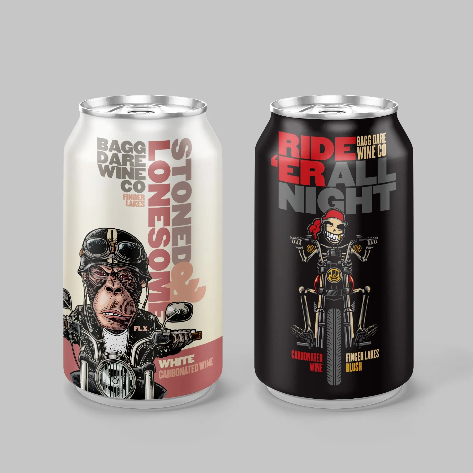
One of my favorite clients I worked on at The Martin Group was Three Brothers Wineries. They were always very receptive to crazy/creative ideas whether it be different printing techniques, or providing crass names for one of their whimsical wineries on site.
Along with my design partner Paul England who created the artwork for “The Devil Went Down” (featured in the can mockup), I created the artwork for “Stoned and Lonesome” and “Ride ‘Er all Night”. These cans fit in their existing winery range, Bagg Dare, where the overall feel is a backwoods biker bar, appealing to more than just the typical wine tour demographic. Their overall brand feel of Bagg Dare is playful, slightly crass, and certainly cynical. We created these cans to fit within those same characteristics. The cans were eventually adapted into a more traditional wine bottle design.
The Vicious can was one that I worked on with illustrator Mike Gelen. We were tasked to create a canned wine to fit into their preexisting Passion Feet series that we created a year prior. We used the same silhouette as a starting point, and were inspired by Medusa’s fierceness, therefore picking up the snakes as the hair piece. We also employed a printing technique to allow for the snakes to appear metallic with a can show-through to that texture.
Team:
Dion Pender, creative direction
Duane Bombard, copy
Paul England, art direction
Mike Gelen, illustration